Heart of our Home
Our kitchen doesn't get a lot of sunlight until the late afternoon/evening. However, that is not an excuse to have toothpaste white walls, cabinets, counters, and floors like the previous owner chose. I do appreciate her neutral design approach because that allowed me to work my creativity throughout the house. The cabinets were in great shape so I updated them with new knobs & pulls. I reworked the walls by painting & removing the floral border. Entry and pantry doors got trim affixed to them to mimic a raised panel style. We replaced mismatched lighting fixtures and added a back splash.
The applied wall paint is "Gobi Desert" by Behr. All of the accents are an oil rubbed bronze finish in a warm brown tone. In the future it would be nice to update the mismatched appliances. However, "If it ain't broke, don't fix it" applies to these vintage energizer bunnies...
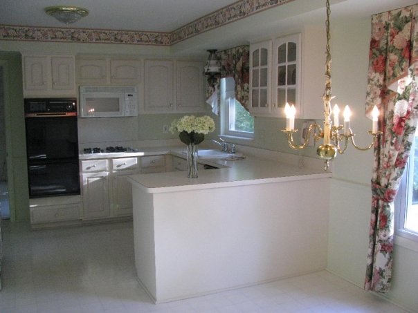
Kitchen before: Notice how low the golden chandelier is hung. It practically touched the breakfast table.
Kitchen before: Notice how low the golden chandelier is hung. It practically touched the breakfast table.
Progress picture. Border is down, walls are painted (in person they are more
Progress picture. Border is down, walls are painted (in person they are more
tan than green), light fixtures are updated (Costco), and knobs are changed out (True Value Hardware). Notice the red chairs from our previous home match the original curtains perfectly and they are my favorite color - RED!
Progress picture of the back splash project. Goodbye linoleum back splash behind the stove!
Destruction/construction of the tile back splash
Ta-DA!
Hello natural tumbled travertine tile with oil rubbed bronze accents.
Ta-DA!
Hello natural tumbled travertine tile with oil rubbed bronze accents.
Fixed up kitchen
Small details add up to a major impact in this space and as a result it is much more enjoyable to spend time preparing food for my family in the heart of our home. More to come in this room, but for now it is portraying my style and flowing with the rest of the house. Very dreamy for just a few hundred dollars. Stay tuned to see how the original kitchen light fixtures get reworked and incorporated in other rooms of our house.


Small details add up to a major impact in this space and as a result it is much more enjoyable to spend time preparing food for my family in the heart of our home. More to come in this room, but for now it is portraying my style and flowing with the rest of the house. Very dreamy for just a few hundred dollars. Stay tuned to see how the original kitchen light fixtures get reworked and incorporated in other rooms of our house.


The pantry doors on the left have trim added to look like a raised panel doors. Later on I added wood carved details and then painted and distressed the trim on the doors. Before this project began, the doors were plain and white. While discussing adding trim my husband said that it would be a, "a waste of time and waste of money". After seeing the added detail he is the first to admit that it was not a waste in one way or another. We are constantly getting compliments on these doors.
We eat most of our family meals in this eat-in kitchen so there are lots of tasty meals, messes, discussions and memories made here. The heart of our home is a happy place to start and end each day.


You have done such a wonderful job beautifying your home! :)
ReplyDeleteCan you tell me where you got your oil rubbed bronze accents? Thank you. Lory
ReplyDeleteHi Lory,
DeleteThe light fixtures were from Costco, door handles from Ron's Hardware on-line, drawer knobs from Lowes, tile accents from a local tile warehouse. I love that they are all oil rubbed bronze in brown tones instead of oil rubbed black. Thanks for asking!
Thanks for letting me know. You did a fabulous job.
ReplyDeleteLory
where did you get the oil rubbed bronze accents... love them
ReplyDelete