Friday, October 15, 2010

Bargain Bath

Our first floor half bathroom was in need of beautification.  For starters I could not stand carpeting in the bathroom, YUCKY and I was not a fan of the apple tree/horse and carriage wallpaper border.  This project needed to be finished quickly and I wanted to keep costs below $100.00.  Here is how I did it:


Shelves above Toilet

Breakdown of project costs:
  • Price Pfister Faucet = $40 EBay (Retails for ~ $140)  Hooray!
  • Wallpaper border placed on top of existing border $15 (including shipping EBay)
  • Light fixture Home Depot = $28
  • 2 door pulls Home Depot Clearance = $5
  • Red paint for vanity & mirror = Free leftover from master bedroom walls
  • picture frames and accessories = Free moved from other parts of the house
  • Linoleum flooring = Free lovely surprise when we pulled out the carpeting
  • Rug = Free from another room in the house
$88 Total = HAPPINESS

Monday, October 11, 2010

Beige to Breathtaking Black

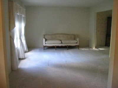
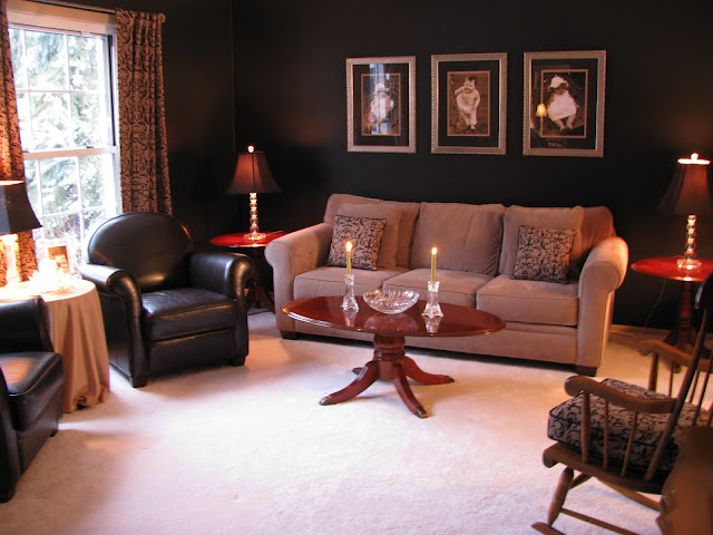
Our formal living room features the most daring design decision I have ever made.  When we purchased this house the formal living room featured beige from the bottom up.  Flooring, walls, curtains, ceiling, and even the furniture were varying from beige to white.  In my opinion, boring and bland, not to mention hard to keep pristine with 3 toddlers.  Working with our existing couch and leather chairs I chose the curtains from JcPenney and they inspired me to boldly paint the walls black! My mom made throw pillows and a cushion for the wooden rocking chair out of an extra curtain panel.  This room has sufficient light during the day, but we really should add recessed lighting on a dimmer switch to illuminate it properly at night.

Here is the Boring Beige Before:


Drum roll please....


Beautifully Black After:

The  coffee table and end tables were a fabulous Craigslist deal ($100.00 for the 3 piece mahogany set), the lamps were 70% off from Joann Fabrics, and the curtain rod was on extreme clearance at Bed Bath and Beyond and I also used a 20% off coupon.  Large picture frames were a splurge from Michael's, but I made sure to get the best price possible by waiting for a sale.  To keep the project costs in check, I printed the portraits at Costco and matted them myself.  The three pictures are the focal point in the room and they turned out beautifully!

The round table was left by the previous owner and doesn't have a very nice finish on it.  I dressed it up with a piece of fabric for a table cloth and that works for now. 

Remember the old light fixture I removed from our kitchen?  Gold detailing be gone! It has been re purposed into a beautiful crystal bowl on the coffee table!  It does have a hole in the bottom, but it works beautifully for displaying seasonal pretty things.  For Autumn I have metallic spray painted pine cones.  It also looks fabulous filled with shiny ornaments for the holiday's.  I love this free beauty!

Stay tuned for photos and information about the adjoining dining room. 
These rooms go hand-in-hand.


Linking up on 5/16/11
HOUSEography House Tour Link Party

Thursday, October 7, 2010

Family Room


The family room functions as a gathering room, media room, and play room.  It is comfortable for every member of our family.  Aesthetically not much has changed in this room besides for the addition of our furniture and accessories.  I did change the window coverings to match our furnishings, but the rest is original.  Once the girls are older we dream about exposing the hardwood floors, changing the paneled walls to drywall, and possibly adding a coffered ceiling in place of the rustic faux beams.  New furniture would be great as well (this couch is over 20 years old - it is comfy and teetering on being considered an antique).  This room is cozy with the fire place and bright and airy with the large window and french doors.

I designed the entertainment center and my husband built it.  There is supposed to be a shelving unit on each side and doors below the television to hide the stereo equipment.  We shall see if it is ever completed... still dreaming, but thrilled with it so far.  He did a fantastic job!


The ottoman was built by my husband and I for around $75.  It is perfect to keep toys out of sight. 


This is where the fun is at! 

The book shelves are refurbished kitchen cabinets that I painted and added trim to.  They were completed before we moved into this house and it is amazing how perfectly the paint ("Dune" by Sherwin Williams) matches the walls.  They look like built-ins and I love that! 
 The child size table was left behind by the previous home owners and I painted it to match the chairs that I bought at Salvation Army for less than $3.00 each.  By painting and recovering the seats, they look brand new!  Such a deal.  Too bad there were not three or more chairs available. 
 To keep clutter to a minimum, we use Longaberger baskets to organize our toys.  It also makes for easy cleanup that even the kids can do, if they are willing...
You will notice throughout our home that in most cases I use photography for artwork.  Nothing makes a house feel more homey than to be surrounded by photos of the people you love. 

Here is a photo of the family room before we moved in:

 
Update:
 
New furniture, table lamps, and framed family photos make the family room cozy for us and our guests. 
 
 
The family room is  where we watch movies & warm up by the fire during Michigan winters. 
 

Wednesday, October 6, 2010

Fixin' the Kitchen

 
Heart of our Home
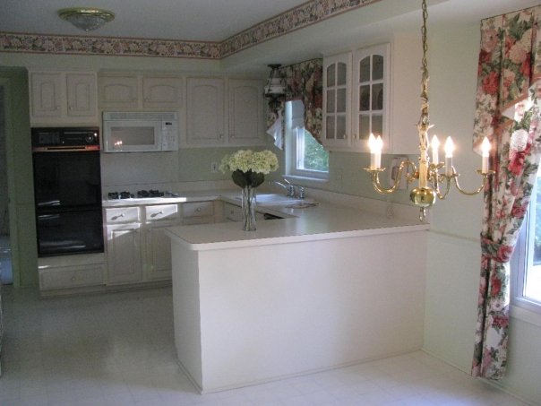
Our kitchen doesn't get a lot of sunlight until the late afternoon/evening. However, that is not an excuse to have toothpaste white walls, cabinets, counters, and floors like the previous owner chose.  I do appreciate her neutral design approach because that allowed me to work my creativity throughout the house.  The cabinets were in great shape so I updated them with new knobs & pulls. I reworked the walls by painting & removing the floral border.  Entry and pantry doors got trim affixed to them to mimic a raised panel style.  We replaced mismatched lighting fixtures and added a back splash.
The applied wall paint is "Gobi Desert" by Behr.  All of the accents are an oil rubbed bronze finish in a warm brown tone.  In the future it would be nice to update the mismatched appliances.  However, "If it ain't broke, don't fix it" applies to these vintage energizer bunnies...  

Kitchen before:  Notice how low the golden chandelier is hung.  It practically touched the breakfast table.


 Progress picture.  Border is down, walls are painted (in person they are more
tan than green), light fixtures are updated (Costco), and knobs are changed out (True Value Hardware).  Notice the red chairs from our previous home match the original curtains perfectly and they are my favorite color - RED!
 

Progress picture of the back splash project.  Goodbye linoleum back splash behind the stove!  

  
Destruction/construction of the tile back splash


Ta-DA!
Hello natural tumbled travertine tile with oil rubbed bronze accents.
 

Fixed up kitchen 
Small details add up to a major impact in this space and as a result it is much more enjoyable to spend time preparing food for my family in the heart of our home.  More to come in this room, but for now it is portraying my style and flowing with the rest of the house.  Very dreamy for just a few hundred dollars.  Stay tuned to see how the original kitchen light fixtures get reworked and incorporated in other rooms of our house. 


The pantry doors on the left have trim added to look like a raised panel doors.  Later on I added wood carved details and then painted and distressed the trim on the doors.  Before this project began, the doors were plain and white.  While discussing adding trim my husband said that it would be a, "a waste of time and waste of money".  After seeing the added detail he is the first to admit that it was not a waste in one way or another.  We are constantly getting compliments on these doors. 
 
 
We eat most of our family meals in this eat-in kitchen so there are lots of tasty meals, messes, discussions and memories made here.  The heart of our home is a happy place to start and end each day. 


Tuesday, October 5, 2010

Completing the Retreat


After two years of enjoying our home, I decided to take the plunge and complete the retreat.  The master retreat that is.  The 80's wallpaper, 70's tile floor, the inadequately low vanity, and dim lighting had to go.  Onward and upward to the do-it-yourself bathroom remodel of the summer of 2010.  Here is the bathroom before the makeover:


The beautiful and timeless vanity was purchased from Costco.  The faucet and floor tiles were ordered from Overstock.com.  The light fixture is from Home Depot.  The beveled, solid wood mirror above the vanity was a fabulous $35.00 find from Big Lots.  The paint is "Dune" by Sherwin Williams.
Here is the glorious after:
The medicine cabinet to the left of the vanity took some creativity.  I took the original louvered door and faux painted it to look like wood and then I had mirrors custom cut to fit over the louvers.  I used "Liquid nails for mirrors" to adhere them to the cabinet front.  Check out the transformation:

The window wall in this space originally had shutters that took up a lot of space and were difficult to close.  Before: 

 I purchased a Cherry wood 1" blind from JCPenney and topped it with an embroidered valance I ordered on E-Bay.  The Wooden wall decor was $10.00 from Big Lots and the Hula girls were purchased on our Hawaiian Honeymoon.

Shower door/medicine cabinet before remodel

Shower Door After

The shower door was something that my husband was adamant about keeping.  I racked my brain for a way to beautify it and came up with this decorative film that I ordered from E-Bay.  This $12.00 purchase (including shipping from Korea) satisfies both of us.  If in the future we get tired of the look it can be removed.  

Ahhh the master retreat dream is complete. 
5/23/2011 Linking up to:
HOUSEography House Tour Link Party

Romantic Retreat

My favorite color is RED and my four year old is always quick to tell everyone that "mom's favorite color is red".  I decorate with red quite a bit and LOVE how it makes a very bold, yet elegant statement.  When we purchased our home, the master bedroom was a bland, boring beige oasis.  We removed the faded beige carpeting and refurbished the gorgeous wood floors below.  The floral wallpaper border had to go as well.  I painted 2 accent walls with Behr's "Deep Merlot" and the remaining walls are a light and airy "Dune" by Sherwin Williams.  It turned out to be such a wonderful, romantic retreat for my husband and I.  Therefore, I decided to submit a photo of it in a contest that the  Detroit Free Press was having for Valentine's Day 2009.  It was such a joy to have a design of mine printed and published!  As a side note, the editors did change the title of my room from "Red Hot Retreat" to "Sleepy Retreat", but I am still thrilled about the opportunity (See below to see the news article).  Here's the submitted photo
Our bedroom furniture was purchased at a furniture store called Classic Interiors.  It was going out of business and we used our cash wedding gifts to buy the four piece bedroom set.  A timeless and beautiful investment.
The lamps were purchased at Wal-Mart, the throw pillows & curtains were hand sewn by my mom, and the rugs (three piece set) were purchased from Craigslist for $30.00.  Picture frames are from Joann Fabrics and the photos are from our wedding day.  This is the master bedroom of my dreams and I get to share it with the man of my dreams.  What could be better than that?!

The antique chair in the corner is from my husband's grandmother.  I like how the curves mimic the curves of the sleigh bed and the wood tones are very similar.  The map art was purchased at JC Penney.

Detroit Free Press Homestyle section newspaper clipping February 2009:

Here is a picture of the master bedroom before we moved in:

Linking up with

HOUSEography House Tour Featured